Pathway Invitation Design
How might we enable users to quickly locate, understand, and participate in their invited pathways?
Role and Team
I was the Senior Product Designer and only UX/Product Designer in the company. I worked with two Product colleagues and a development team
Methods
Journey mapping, Usability testing, Workshops, Wireframing, High-fidelity design
Timeline
4 weeks

An example of a COPD management pathway
Context
Calcium offers B2B and B2C solutions to keep people healthy, including a pathways framework in which a provider, employer, or any administrator can gather information from end-users through the mobile or web app. It’s kind of like enrolling in an educational online course, but for your health. Currently, the most common use is for employers to use pathways to monitor their employee’s vaccination status and daily COVID-19 risk.
The app itself also offers the ability for end-users to sync fitness devices, manually track health data, and join pathways and challenges to stay healthy. The ultimate goal is for the app to be used by clinicians to easily collect information from patients to provide more consistent care even when they don’t see the patient in person.
The Challenge
Based on feedback from our Customer Support team, we knew that many employees had difficulty locating their COVID-19 pathways once they were invited. This meant that employees could not take the daily survey on their COVID-19 exposure or indicate their vaccination status, leaving employers without crucial data. We also knew that we wanted to use pathways for our future provider use cases.
We set out to answer the question: how might we enable users of the COVID pathways to quickly locate, understand and participate in their pathways, while also accommodating our future clinician/patient use case?

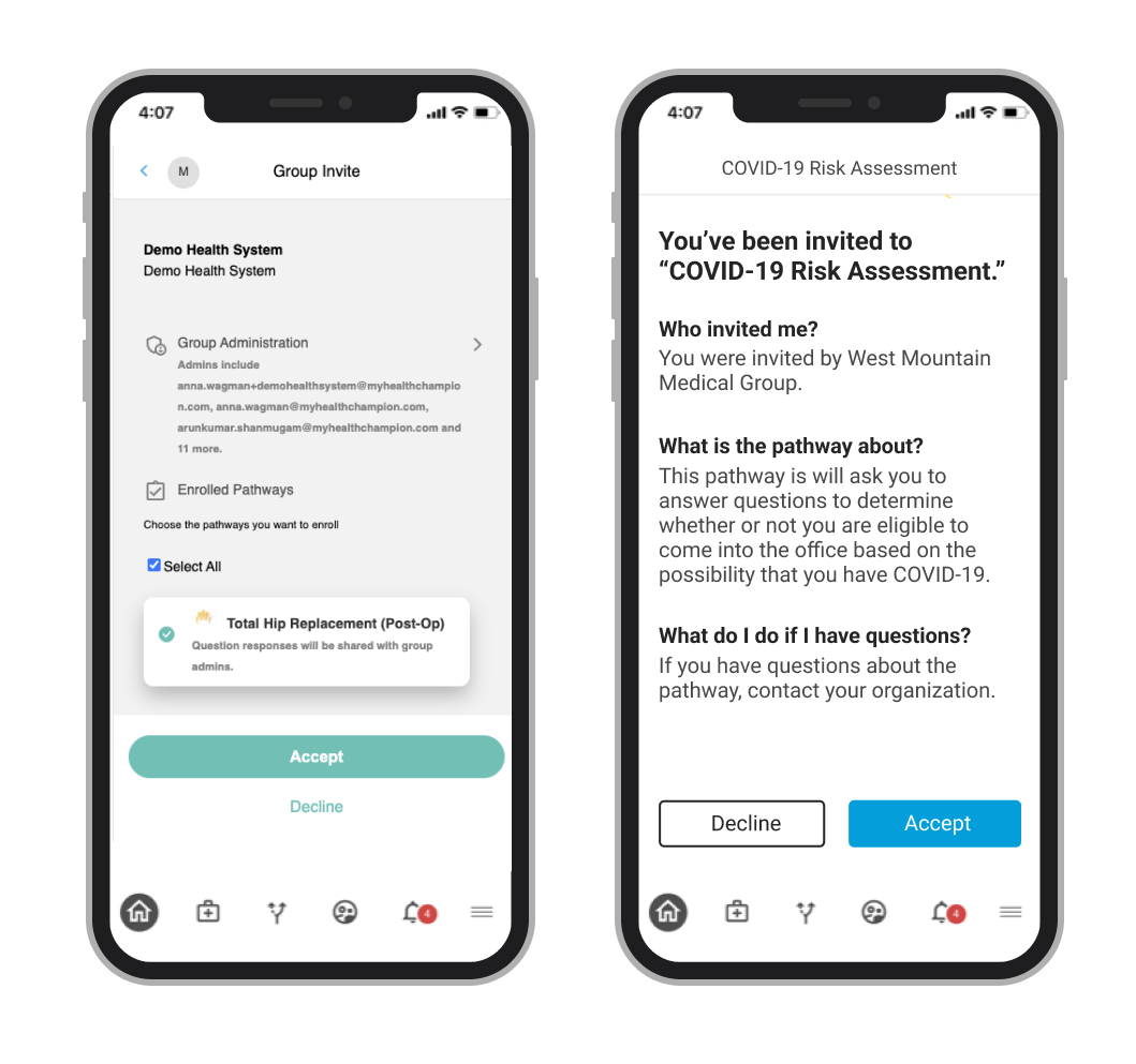
The initial pathway invitation notification, pathway and group invitation and pathway list
Next Steps
Current state analysis
First, I evaluated the current workflow to further familiarize myself with the current flow. I noticed some basic usability issues:
there was no way to distinguish what pathways you were invited to versus those available to browse, or those you may have completed or accidentally quit
the pathway description was separate from the pathway invitation
there was also a loop in which users could get stuck after accepting the first invitation because the current flow required the user to accept a group with the pathways, and then another pathway invitation
Research
Next, I conducted research with 7 people who had never used our application previously to understand the current state’s usability issues, with a focus on the flow I had previously identified.
The research showed:
users could not find the current pathway invitation
users thought the pathway invitation was confusing
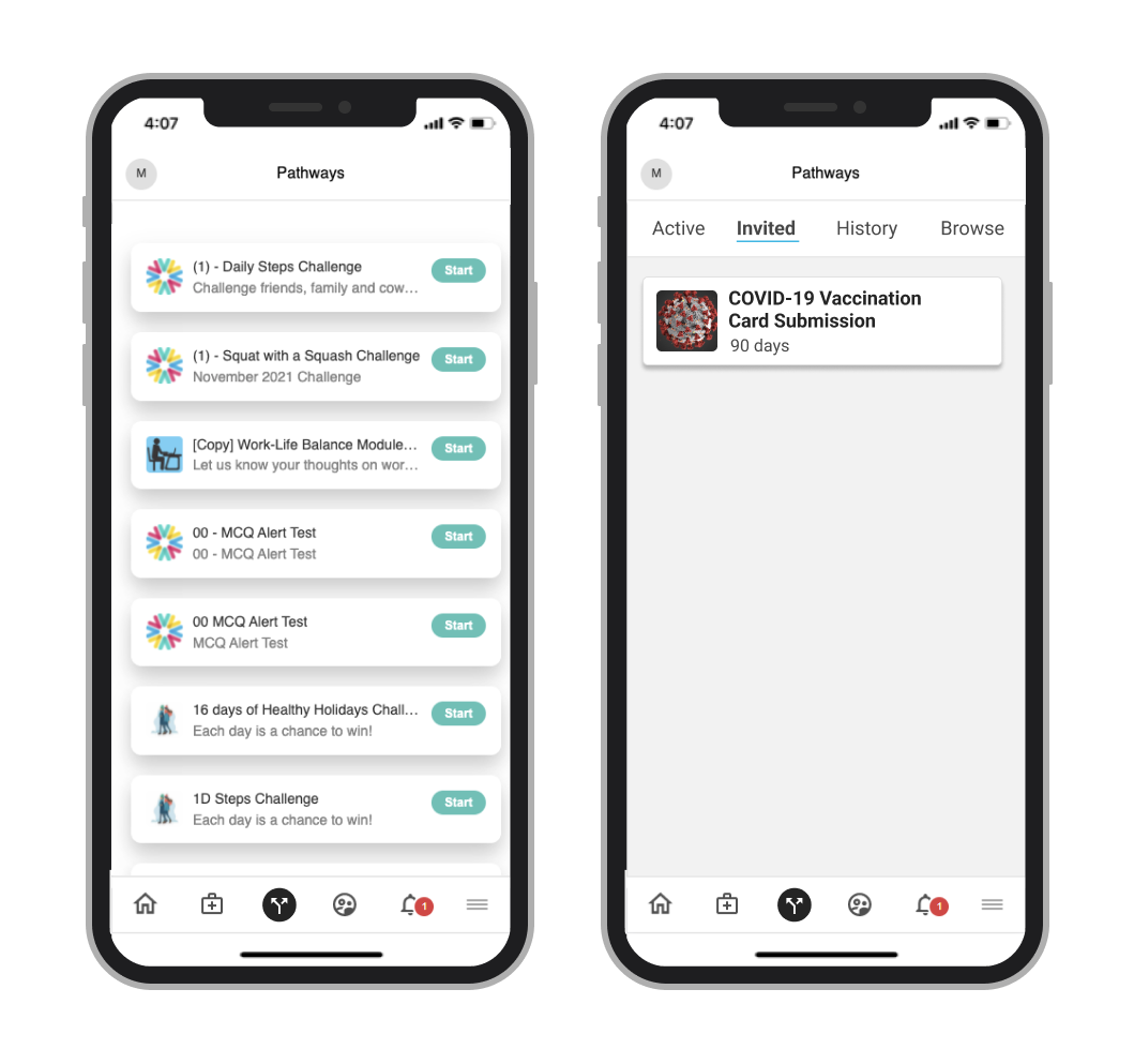
users were overwhelmed by the lengthy pathway list and could not easily find which pathways they’d been invited to versus which were active
Updating the Requirements
Based on the issues I identified and the results of the research, I created a new list of requirements:
the notification for a pathway invitation needed to be extremely obvious to a user
users needed to be able to quickly and easily determine the expected functions in the pathway and who had invited them
the pathway list needed the ability to see the user’s status for a pathway - whether they were invited, completed, had quit, or they could just start a new one
the workflow needed to take the user from initially viewing the invitation to getting to the pathway seamlessly
Edge Case Planning
Although our current use cases were typically organizations inviting one user to one pathway, we needed to explore what would happen if that scenario changed by the number of pathways, the number of organizations, and the timing of when a user was invited to an organization and to a pathway.

Before and after pathway invitation workflows (three fewer steps!)
When drawing out solutions, I also walked through scenarios in which the user was:
invited to more than one pathway at a time.
invited to different pathways by different organizations.
invited to an organization, then invited to a pathway without a user having seen or acted on the organization invitation
invited to an organization, act on the the invitation, then be invited to a pathway

Updated pathway flow
The Solution
I designed a simple workflow that would give the user the information they need when they needed it and eliminate unnecessary steps.
The flow included an impossible-to-miss yet informative pathway invite notification, a stripped down and simplified pathway invitation with friendlier language, and a reorganized pathway list page. The notification and invitation would provide information about the expected functionality of the pathway, which could be customized by an administrator in our separate pathway creation application.

Before (left) and after (right) pathway invitation notifications
A new pathway invitation notification
I added a pathway invitation overlay that would be displayed the first time a user logged into the app after being invited - the wording would address the user by name for personalization, . The brand colors I had to choose from were very limited, so I chose the pink since it was the only one that was passed color contrast ratios for accessibility with white text.
The user would have to make a decision in order to exit the modal, which would be more likely to make them read the text. This was especially important since this was more than likely the only reason they had joined the app. The text would give cursory information about the expected functionality of the pathway - in this example of an assessment pathway, it would be “The pathway will ask you to enter specific information in a given timeframe.” The “take me to the pathway” button" would take the user to the updated invitation page. Clicking “I’ll check it out later” would close the modal and the user would be reminded again in 24 hours.
In the case that the user was invited to more than one pathway, whether it was by the same organization or several, the message would be “You’ve been invited to x pathways” and the button would say “Take me to the Pathways,” which would take the user to the “Invited” tab of the Pathways page so they could select which they wanted to view and learn more. (I also determined the flows for additional edge cases involving different combinations of organization and pathway invitations.)
Before (left) and After (right) pathway invitations
A new pathway invitation page
For the pathway invitation, I removed the extraneous information and clearly stated that they had been invited to the specific pathway. I also made the font bigger (I changed the font-size across the app for readability) and added direct questions in bold so the user could easily understand the information. I also added our new primary/secondary button scheme. Once the user clicked “Accept,” they would be taken directly to the pathway, instead of staying on the “People” page in the previous flow.
Before (left) and After (right) pathway page
An updated pathway list page
The pathway list page would be updated with four tabs: Active, Invited, History and Browse. This would allow users to easily access their active pathways, know which they had pending invites for, which they had previously interacted with, and which they could browse freely.
I removed the “start/active” label from the initial design because the pathway name was being cut off and users did not really notice the button in testing. It also encouraged the user to click on the pathway itself to learn more so they could understand the pathway functionality.
Initially, I had chosen “archived” as a tab instead of history, but later realized that we had overlooked the requirement that pathways could be quit or they could lapse. Ultimately, we decided “history” accommodated all of our statuses.
Outcomes
Based on the project timeline, some changes were made to my initial designs for MVP. Categorizing the pathways by function and providing the custom type of information for the pathway types would need to be accommodated in our pathway creation studio and databases, which was not in scope. We decided to scale back the customized pathway invitations to only include the title of the pathway and the organization that invited the user. We also used the existing pathway description to tell the user what the pathway was about in the invitation itself.
Because an urgent initiative around pathways was being released, the designs went live before we could test them. However, the Customer Support team reported that they no longer received phone calls from users because they could not locate their invitation, which I considered a big win!
Challenges
Lack of time for extensive UI
When I took on this project, we didn’t have a pattern library or design standardization. To make matters a bit more complex, the company was also going through a brand change during this time and it was unclear if our colors would be changing. Unfortunately, our existing brand colors were not ideal for accessibility standards and I decided to use a hybrid of the brand colors and the Bootstrap default colors to speed up the process and would change them later if the colors did indeed change.
For this fast-moving project, I used components from the new Bootstrap theme and adjusted it with our colors and with any other tweaks I deemed necessary with the intent of improving it later on.
Complex business rules and functionality
Adjusting the flow for the pathway invitation had wide-ranging implications for our product, which meant I was juggling a lot of non-prioritized functionality that would need to change in the future. Ultimately, we needed to change a parallel flow for an invitation to an organization as well as a pathway invitation, but we didn’t have time to execute that change. I had to prioritize designing for the pathway invitation flow while also keeping in mind the future organization invitation flow and the implications the pathway flow would have.
I ultimately designed both at the same time, but fleshed out the UI for the pathway flow so it could be quickly passed on to development. I also knew that designing the invitation flows the way I wanted (with custom information for the specific pathway in order to give the user all the information they needed) required changes in our pathway builder product. This also was not in scope, however, so I kept notes on what I wanted to change in the future and prior to leaving the company, created designs and development tickets for the team to implement at a later date.